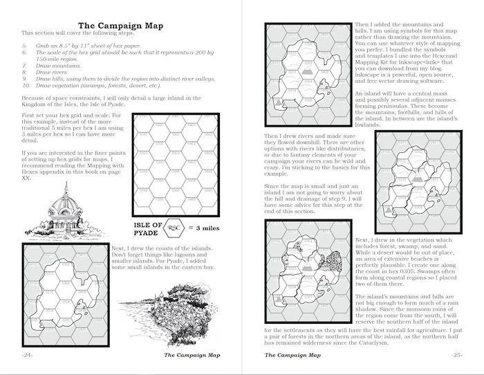
How to Make a Fantasy Sandbox Beta Layout
I am pleased to share the first beta layout of How to Make the Fantasy Sandbox Kickstarter for my backers.
Some of the art are placeholder pieces. I have been buying stock art over the years but there are gaps, particularly in pieces that depict various characters. Thanks to your generosity I can not only cover those gaps but also expand the amount of custom pieces I can order.
I want to give a shout-out to Fat Goblin Games, and The Forge Studios where I bought much of my art from. They both have Patreons and I recommend them if you are looking for art for your project.
The various maps and other example illustrations are created by myself and represent the final version. There may be further tweaks because the original we designed to be part of a blog post.
The PDF is bookmarked but I haven't linked all the URLs yet.
Further Steps
Up on deck is the beta layout for the Isle of Pyade.
The print proofs for the new digest version of Blackmarsh have been shipped. Like with my Majestic Fantasy RPG Kickstarter, I will be releasing the print codes immediately after I check over the proof. Each backer will get a code for the hardback version and the softcover version.
Interviews and Livestreams
I have had a couple of interviews and livestreams talking about How to Make a Fantasy Sandbox.
Random Party Generator
The regular livestream that I am part of.
Games with Dave
A live stream where Dave and I talk about the Kickstarter and fantasy hexcrawls.
Fumble Table
Damien and I discussed Fantasy Sandboxes and my background in fantasy roleplaying.
Also, check out his review of Blackmarsh
Wrapping it Up
Again I appreciate everybody's support and feel free to ask questions and leave comments on the draft and the project.

2 comments:
Thanks for sharing your draft layout image. If I was laying it out, I'd want to increase the white space underneath the main header "The Campaign Map". It's very close to the line "This section will cover the following steps". Those 2 lines of text are a lot closer together than the white space between paragraphs. I also think the left hand margins of the text paragraphs are a bit too close to the map images. There's also a larger line space between the 4th last line and the 3rd last line on page 25. I guess the properties of the last map image are conflicting with the line spacing in that paragraph. Try moving the image down a bit and keep an eye on how the text flows across that line break. Personally I'd remove the 2 line-art illustrations, and adjust the text properties until the text and the maps are sitting comfortably with each other. Then add line-art as required to fill any excessive areas of white space. All the best with it all!
@donjondo, thanks for looking it over. I will see what I can do with the layout given your comments.
Post a Comment